Digital product and branding for a tourist portal. thinkSPAIN
thinkSPAIN
The leading tourism portal in Spain for the English market, thinkSPAIN, was created in 2003 and has millions of visitors and more than 250,000 properties for sale and rent, including agencies and individuals. In addition, thinkSPAIN includes thousands of companies that advertise their services and job offers in Spain, and continuously offers current news and all the information related to living and spending holidays in Spain, making the most of this fabulous country.
The brief
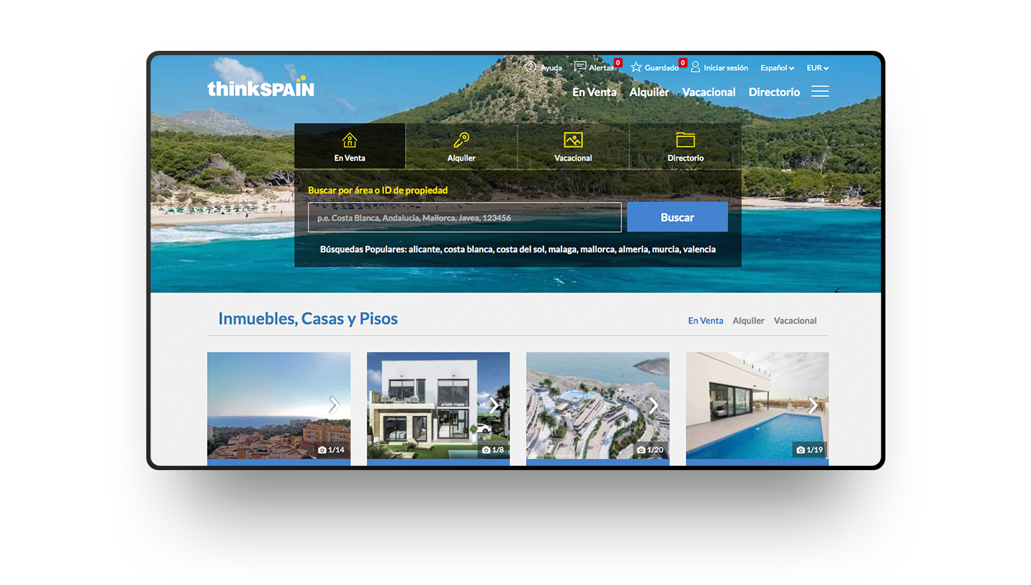
thinkSPAIN trusted us to totally redesign its old web platform, as the new times and its own users demanded an imminent renovation. The project needed a total change focused on improving usability, and offering each user the information and services they need in an agile and intuitive way. From Nectar we carry out a strategic consulting to position both the brand and the digital product. We also carry out SEO consulting, UX UI, and the design and front development of the entire portal, so that every detail is perfectly aligned with the proposed strategic plan.
Digital product strategy
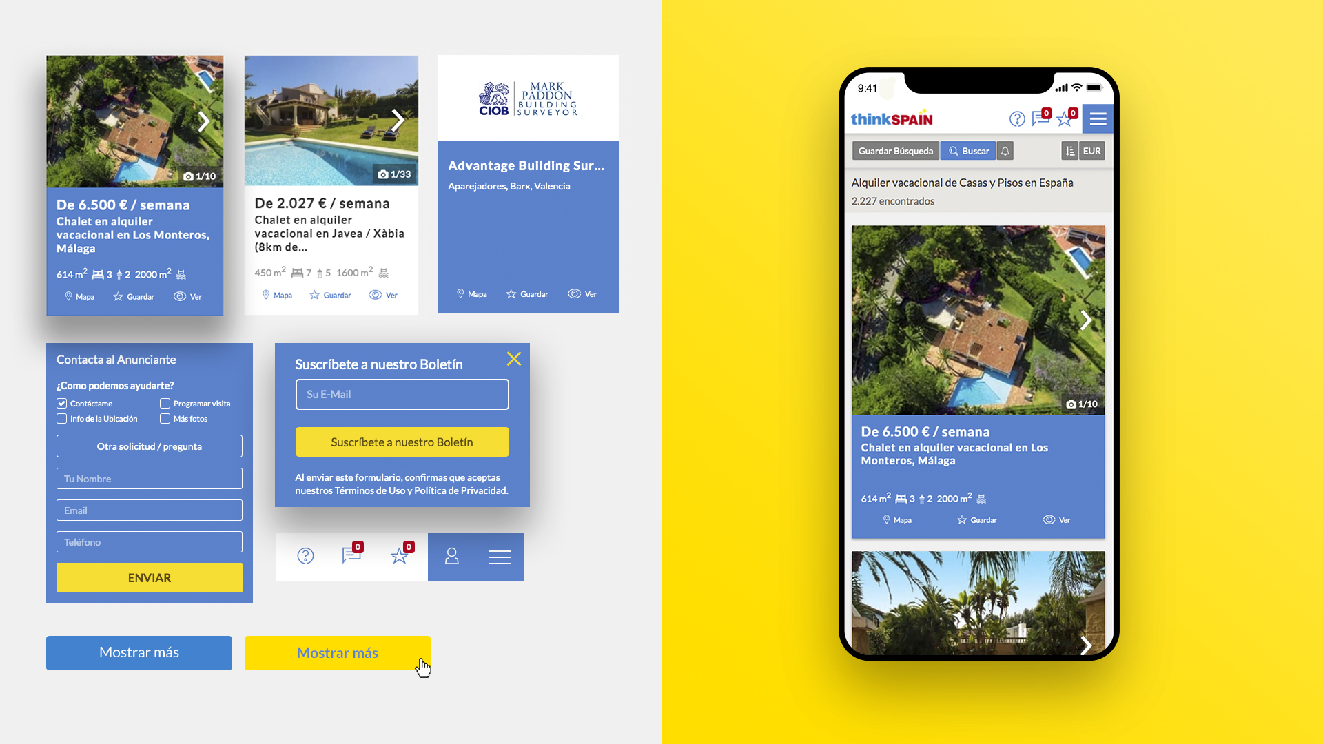
One of the great challenges when designing and developing the portal was to organize the information, prioritize it, and make all the content that is generated daily on the web accessible and easy to consume. The strategy to design and structure the web platform was to work each of the services in differentiated blocks.
All this keeping in mind the integrity, the coherence of the functionalities and the unification of the different visual aspects. Throughout the process we carry out experiments and tests that helped us to propose constant improvements, as well as to evolve the portal in an agile and efficient way.
Visual Identity
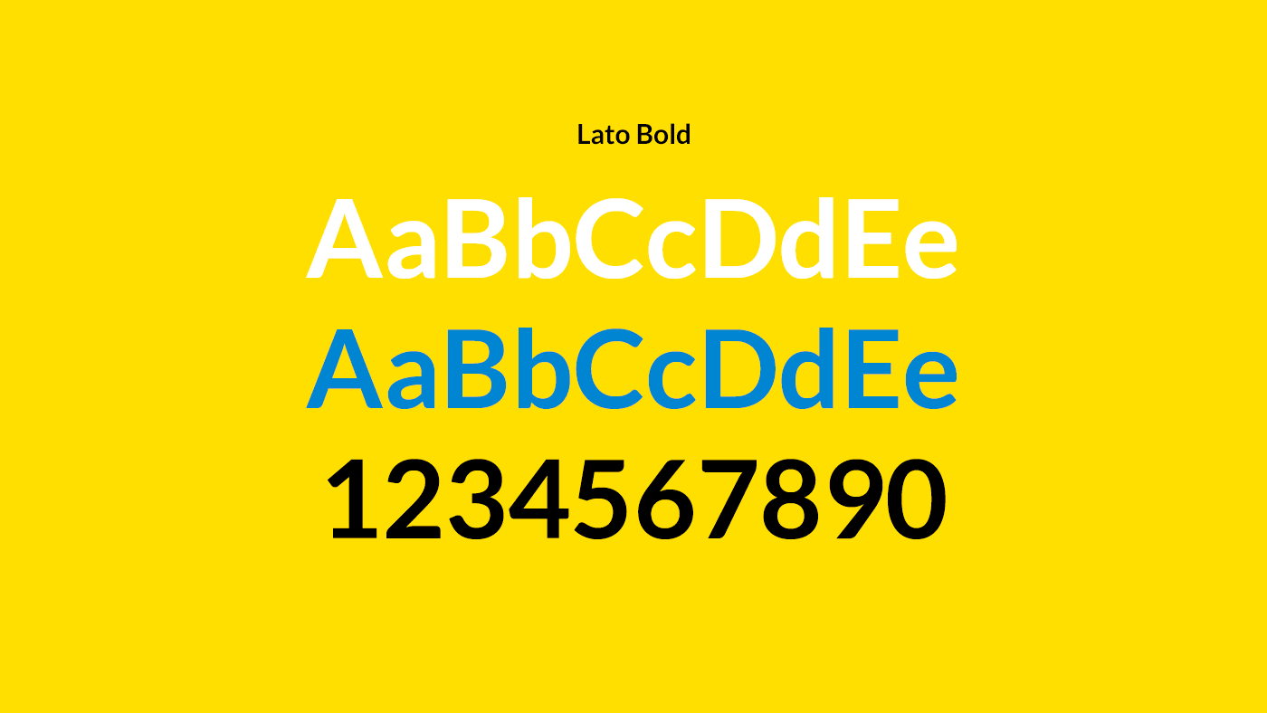
Given the typology of the project, we opted to work on creating a clean, elegant and optimistic visual system. We work on the chromaticism of the brand through yellow (sun, light, heat) and blue (sea, leisure, technology). All this, without exploiting compositions and colors only based on the red and yellow of our flag. Opening our eyes and inviting you to navigate the entire portal in a fluid and positive way as if it were a sea of opportunities, we aim to ensure that each user achieves his goals within the portal: buying a house, working in Spain or spending the best holidays in their lives.
Design system and Atomic Design
A design system is not only focused on unifying the visual part of the platform, but its objective is to optimally and consistently maintain the growth of the portal. Thanks to the “Atomic Design” methodology and the design system that we have developed, we can work quickly and consistently in any part of the project, from the UX UI design to the definition of the micro-interactions and the development of new modules or improvements to the themselves.

“One of the great challenges when designing this portal was to organize the information, prioritize and make all its content accessible.”